A story on why I love PhasePlots.
Why PhasePlots are the BestPlots
This post is about the best plots, PhasePlots. I like PhasePlots because they really let you see how the variable describing your data are connected. Want to see if your data lies along a constant pressure line in the density-temperature plane? PhasePlots can do that! What to figure out why not all the gas falls along your line? Try coloring your data by tcool instead of cellmass! Try making a PhasePlot of tcool versus pressure. Try whatever you want, PhasePlot is ready.
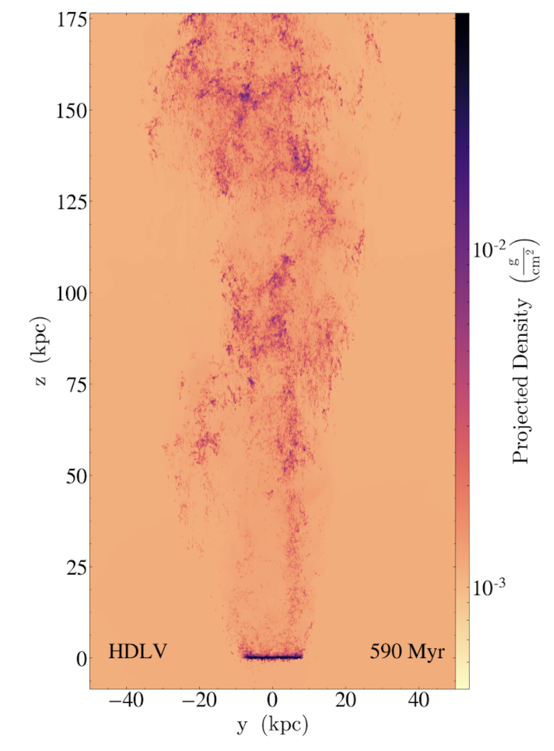
Here is my example from my recent paper: we came up with this nice model for how gas is accelerated from ram pressure stripped galaxies-by mixing with the intracluster medium wind! Here is a nice snapshot from our “wind-tunnel” simulation:

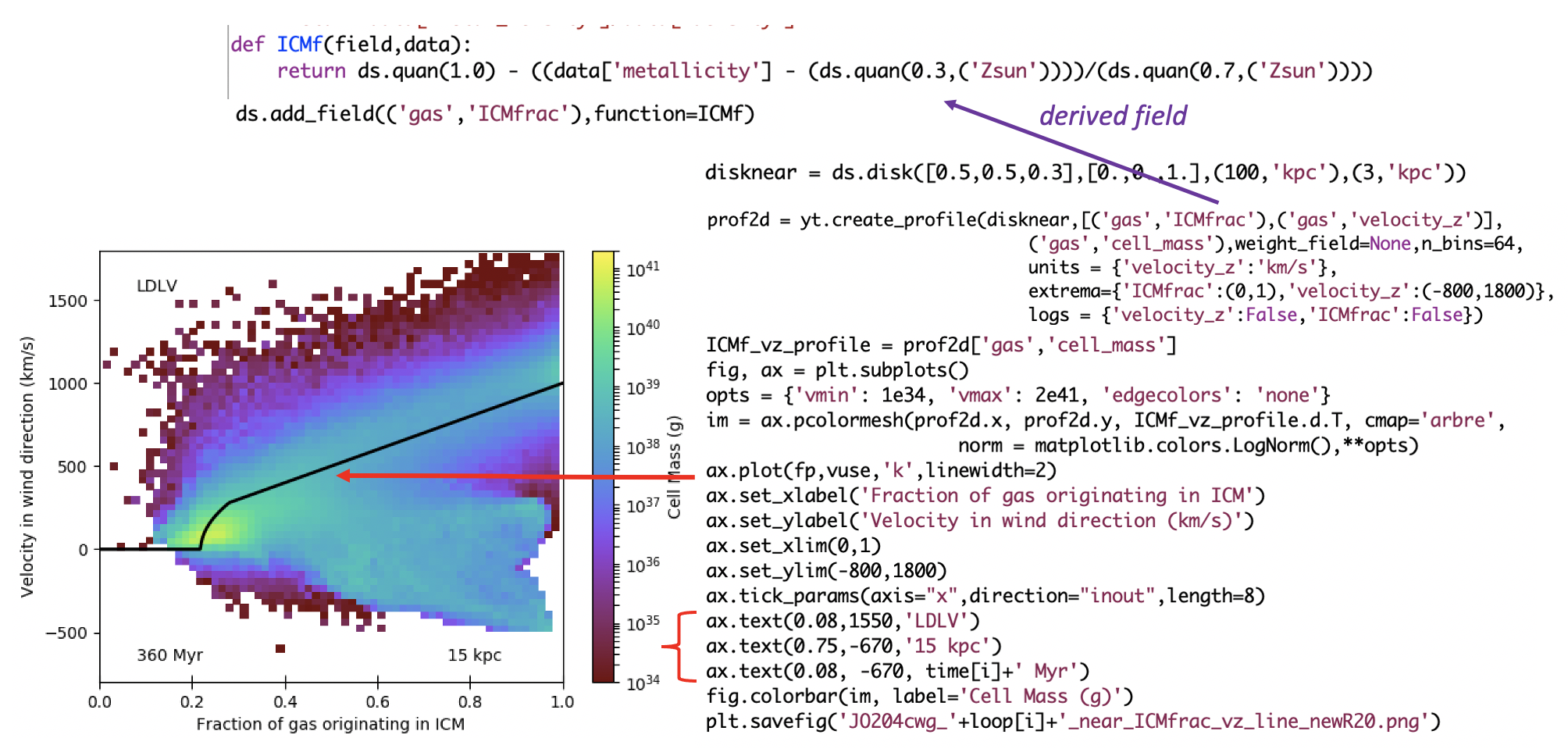
The simplest formula about the tail gas related gas velocity to the fraction of ICM gas. So we used PhasePlots to compare the gas from our simulation to our analytic model. Here are some code snippets next to the resulting PhasePlot:

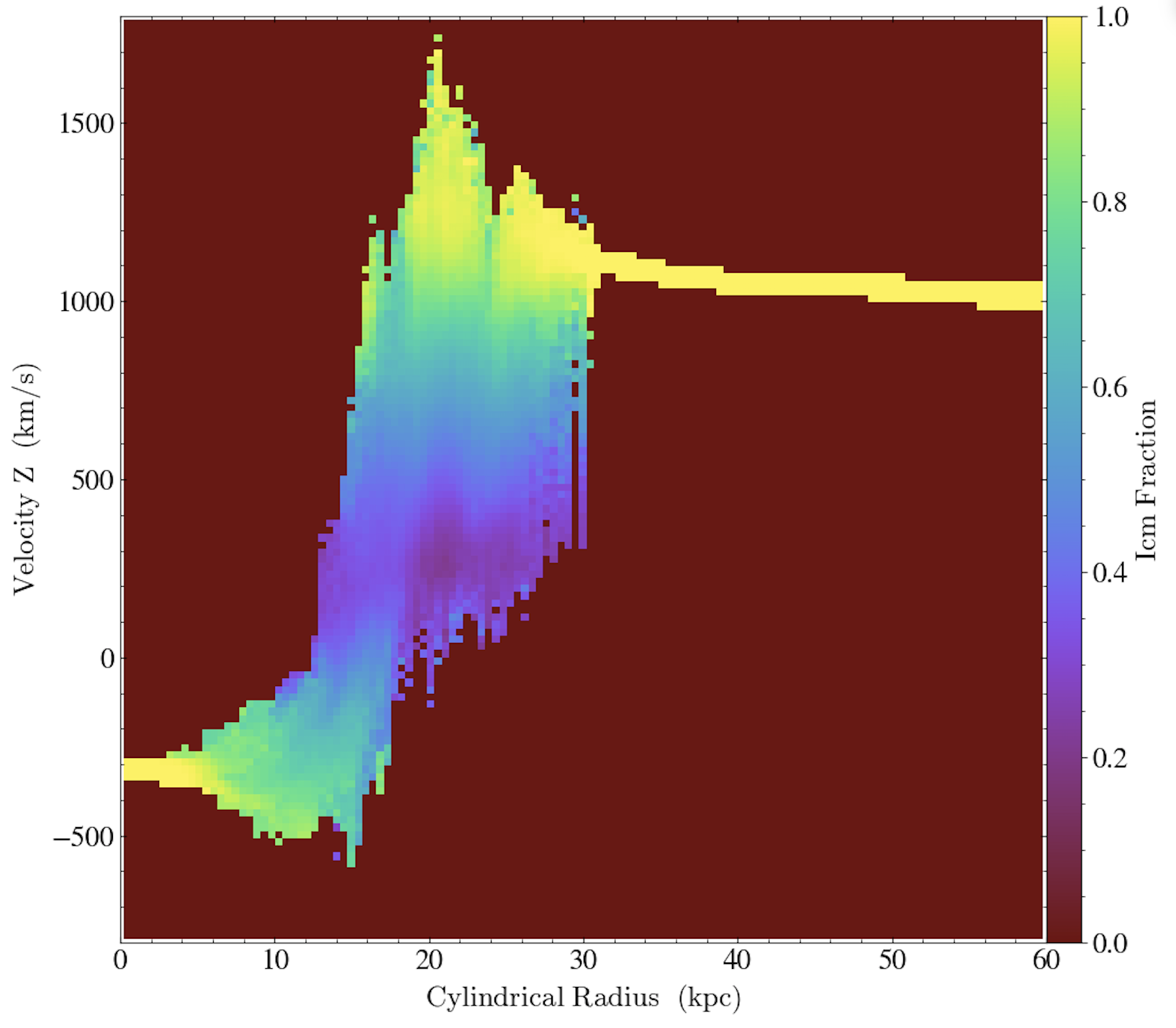
Now I think that is an amazing agreement! But there is one glaring mismatch, the gas with high ICM fraction and low or negative velocities. Once again, PhasePlot came to our rescue. This time we looked at the gas velocity as a function of radial distance, with the colorbar based on this mixed fraction from the ICM.

Ah-ha! The well-mixed gas with negative velocities is all at small radius–in fact, in comparison with the ProjectionPlot above, we see that it is all behind the disk, or in it’s “shadow” protected from the ICM wind! Our model does not account for fallback of this gas, so we can easily understand the mismatch between model and simulation.
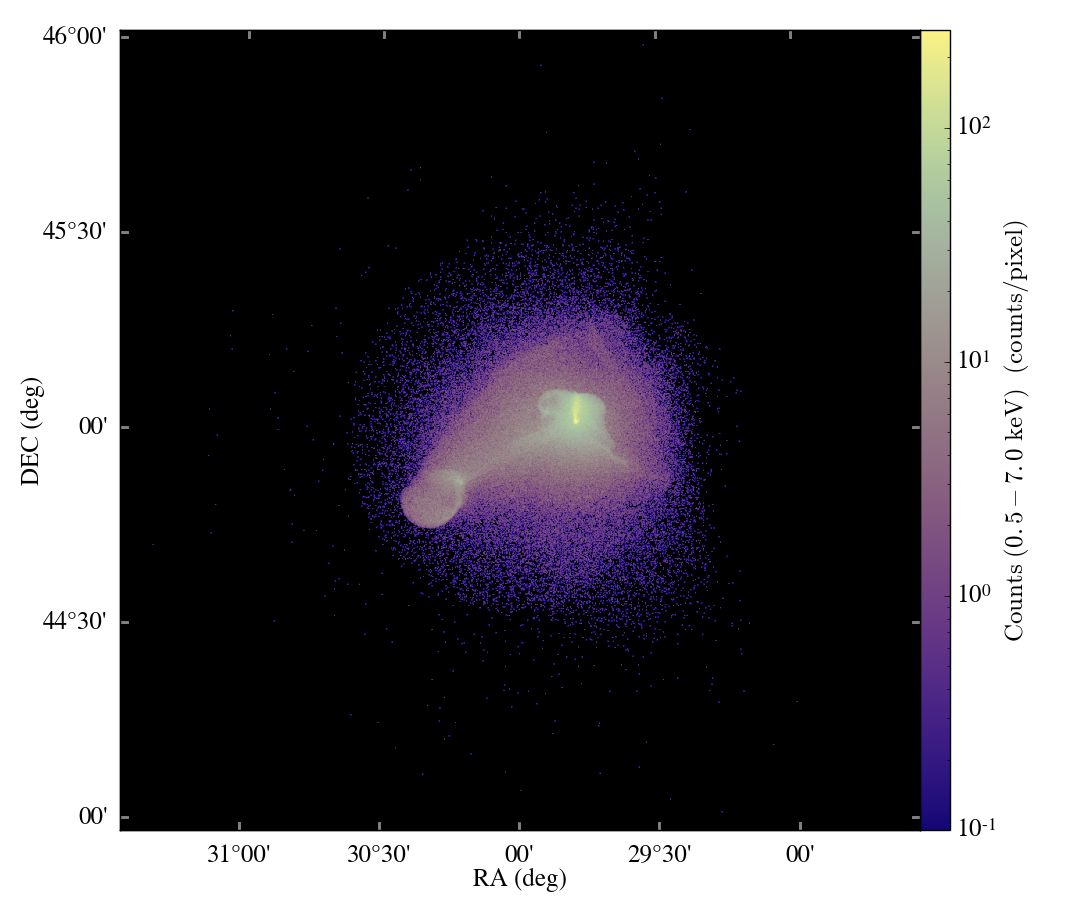
I hope you enjoyed seeing this fun example of the power of PhasePlots, and so I leave you with this:


